Con người
765,000+ hình ảnh


ACworks là một công ty dựa trên sự chuyên nghiệp đã hỏi anh ta và cách mà tổ hợp những người đóng góp công chúng cung cấp tải xuống miễn phí tài liệu mà công ty được hưởng lợi từ các đặc tính độc đáo của nguồn tài liệu này trong biểu tượng illustAC - hiện tại rằng Trong một trang danh mục, bạn sẽ tìm thấy nội dung khác với các kiểu thư viện tài liệu khác.
Bài viết này sẽ giới thiệu toàn diện về các tài liệu biểu tượng trong illustAC từ các khía cạnh sau.
Tôi tin rằng nhiều bạn bè đã xây dựng trang web hoặc viết email HTML biết rằng họ thường gặp khó khăn khi cần thêm biểu tượng vào blog của trang web hoặc các dịch vụ độc đáo khác của trang web. Bởi vì nó không giống như Facebook , Twitter hoặc Like Youtube , hầu hết các trang web cung cấp các biểu tượng được chuẩn hóa. Đôi khi, bạn cần một khung hình điện thoại thông minh thực tế để hiển thị các hiệu ứng của ứng dụng, nhưng bạn không biết bắt đầu từ đâu. Nếu bạn gặp phải những vấn đề này, bạn có thể xem qua biểu tượng danh mục của illustAC.
Nếu phân biệt theo mục đích sử dụng , vật liệu biểu tượng trong illustAC có thể được chia đại khái thành 2 loại: phần tử bản đồ và nền hình ảnh / biên giới.
cái gọi là bản đồ yếu tố thực sự là một gói vật liệu với cùng một chủ đề và phong cách tương tự. Nhờ các phương pháp lưu trữ của vector đồ họa tập tin như AI hoặc EPS , Những bức ảnh này có thể đủ dùng trong thực tế được chia thành các phần tử riêng biệt bằng cách sử dụng chúng. Ngoài ra, bởi vì người dùng thường chỉ chụp một bức khi xử lý một phần nhỏ của việc sử dụng sáng tạo chúng, và do đó không dễ để thiết kế va chạm với những người khác có thể. được cho là loại tranh này là loại linh hoạt và tiện lợi nhất trong tay các nhà thiết kế chuyên nghiệp, đối với chất liệu biểu tượng, bạn có thể chọn một bộ sưu tập chất liệu cơ bản theo sở thích của mình vì khả năng cao là Chứa hết nội dung bạn cần.
Về nội dung, từ biểu tượng điện thoại / fax / email truyền thống , đến biểu tượng bản đồ trong thời đại Internet, các mũi tên và nút được cá nhân hóa được sử dụng trong các trang web, mọi thứ đều có sẵn.
Khi nói đến hình nền, chúng chiếm hầu hết các tài liệu về danh mục biểu tượng. Nói chung, thiết kế của các biểu tượng chủ yếu là đơn giản và rộng rãi. illustAC đã cân nhắc điều này cho người dùng. Trong danh mục hiện tại, bạn có thể tìm thấy nhiều cách làm mới các mẫu cùng kích thước có thể áp dụng trực tiếp. Nhưng nếu công việc của bạn đòi hỏi bạn phải chuẩn bị thêm các biểu tượng cá nhân hóa thì illustAC cũng có thể đáp ứng cho bạn. danh mục cũng chuẩn bị hình nền có màu sắc tươi sáng hơn và đậm hơn và cấu trúc đa dạng hơn.
Để có được độ chính xác hơn Các minh họa / vector miễn phí bản quyền của danh mục biểu tượng đầy màu sắc đang chờ bạn tự tìm kiếm!
Trong illustAC , bạn có thể sử dụng nhiều phương pháp khác nhau để tìm nhanh các hình minh họa / vector biểu tượng miễn phí mà bạn cần.
Tìm kiếm theo từ khoá Đó là một tìm kiếm chức năng mà bất kỳ thư viện nào (ngoại trừ templateAC ) có. Trong illustAC , các đối tượng tìm kiếm là tất cả các nhãn dưới tất cả các hình minh họa biểu tượng / hình ảnh vector! Vì người sáng tạo thường thêm chú thích (thẻ) vào nội dung của đồ họa vector khi gửi bài viết, phương pháp tìm kiếm này có thể bao gồm hầu hết các đồ họa vector miễn phí theo cách cổ điển và sử dụng tài liệu có chứa các từ khóa / từ tìm kiếm theo đồ họa vector. Tần số được sắp xếp. Nếu bạn không muốn sử dụng xếp hạng mức độ phổ biến mặc định, bạn có thể thử chức năng tìm kiếm tiếp theo.
Đó cũng là do đặc điểm của việc chấp nhận các nội dung gửi từ người dùng phổ thông. Các hình ảnh minh họa / tài liệu vector miễn phí của illustAC có thể có chất lượng nổi lớn hơn. Do đó, trong các trường hợp bình thường, chúng tôi mặc định hiển thị cho bạn kết quả tìm kiếm theo tần suất sử dụng hình minh họa / đồ họa vector. Nhưng nếu bạn muốn nhận tài liệu mới nhất, chúng tôi cũng có các chức năng liên quan cho bạn. Chỉ cần chọn [Sắp xếp theo] - [Mới nhất] trong thanh tìm kiếm đã được tinh chỉnh ở bên cạnh trang để nhận các tài liệu đầu tay do người sáng tạo tải lên!
Để hiển thị tối đa các tài liệu trong thư viện tài liệu, chúng tôi đã giảm độ chính xác của tìm kiếm. Đây cũng là bạn thỉnh thoảng trong “ biểu tượng ” nhìn thấy trong trang tìm kiếm từ khóa “ người ” hoặc “ quả ” và các lý do khác clip. Nếu không thích các kết quả tìm kiếm như vậy, bạn có thể sử dụng [loại trừ từ khóa] cũng nằm trong thanh tìm kiếm được tinh chỉnh để loại trừ những kết quả bạn không muốn thấy. Trong trường hợp trên, miễn là bạn loại trừ từ khóa “ people ” , “ fruit ”, bạn có thể tiếp cận tìm kiếm tài liệu biểu tượng được nhắm mục tiêu chính xác cao hơn. Chức năng này hỗ trợ loại trừ nhiều từ khóa / thuật ngữ cùng lúc. Nhưng hãy nhớ ngăn cách các khoảng thời gian này bằng dấu phẩy.
Nhìn chung, mức độ màu sắc để giúp tìm kiếm đồ họa vector và không thực sự lớn như vậy ---- xét cho cùng, xã hội loài người, hầu hết các đối tượng đều Có thể nhuộm. Tuy nhiên, khi tìm kiếm các danh mục biểu tượng, nó không phải là tuyệt đối (thậm chí có thể nói là rất hữu ích). Rốt cuộc, một số biểu tượng thậm chí còn được cố định về màu sắc. Tìm kiếm theo màu sắc, bạn có thể dễ dàng giới hạn phạm vi hiển thị của kết quả tìm kiếm. Ngoài ra, bạn cũng có thể sử dụng chức năng này khi tìm kiếm các biểu tượng minh họa / đồ họa vector phù hợp với màu sắc của bài viết hoặc trang web.
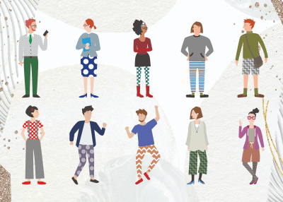
Mặc dù một người là một biểu tượng, nhưng trong illustAC để minh họa miễn phí cơ thể người / sơ đồ vector hầu hết được phân loại thành “ cả nhà ” danh mục. Với cài đặt này, cố gắng tìm kiếm theo số lượng người trong danh mục biểu tượng là rất nhàm chán. Nhưng không có gì là tuyệt đối. Ví dụ: nếu bạn muốn tìm hiệu suất của “ con người và thiên nhiên sống hòa hợp ” tài liệu biểu tượng, thì có thể [trong] số lượng mô hình thanh tìm kiếm được tinh chỉnh được đặt thành 1 trong trường hợp tìm kiếm. Tại thời điểm này, bạn rất có thể sẽ thấy các hình minh họa / vector trong đó người và biểu tượng cùng tồn tại. Và như vậy, trong một số tình huống cụ thể, tìm kiếm theo số lượng người có thể giúp bạn thu hẹp tìm kiếm của mình một cách nhanh chóng.
Tìm các hình minh họa / đồ họa vector tương tự là một phần của quá trình thực thi tự động khi tìm kiếm trong illustAC. Chức năng này sẽ được chia thành hai loại theo giao diện.
Bạn muốn chỉnh sửa đồ họa vector nhưng không có trình chỉnh sửa hình ảnh trong thiết bị của bạn? Bạn nghĩ rằng tài liệu biểu tượng được tìm thấy trong quá trình chỉnh sửa phải được tải xuống và nhập trước khi chỉnh sửa có phiền phức không? Trong illustAC , bạn sẽ không có cơ hội trải qua những rắc rối như vậy! Đối với mỗi hình ảnh minh họa / vector , chúng tôi đã thiết lập một nút chỉnh sửa. Ngay cả khi bạn không vào giao diện tải xuống của từng hình ảnh, bạn có thể nhấp vào nút chỉnh sửa xuất hiện khi con trỏ di chuột qua hình ảnh minh họa / vector và sau khi chọn kích thước bạn muốn chỉnh sửa, bạn có thể tự động chuyển đến ACworks ' Trình chỉnh sửa hình ảnh miễn phí biên tập viênAC (Có phiên bản tiếng Trung phồn thể). Sau khi hoàn thành bước nhảy, bạn không cần thực hiện thêm bất kỳ thao tác nào, vật liệu đã chọn sẽ được tự động tải lên canvas để bạn chỉnh sửa trực tiếp. Từ việc đảo / căn chỉnh đồ họa vector , cắt theo hình dạng và thêm văn bản, đến vẽ biểu đồ và đồng chỉnh sửa với nhiều người, tất cả các chức năng cần thiết để xử lý hình ảnh đều có sẵn. Và điểm quan trọng nhất: chúng đều miễn phí!
Nếu bạn thích các hình minh họa / đồ họa vector hoặc đồ họa vector trong danh mục biểu tượng hiện tại , bạn có thể tải xuống miễn phí. Để phù hợp với các mục đích khác nhau, chúng tôi đã chuẩn bị các định dạng tệp JPG , PNG và AI / EPS cho bạn lựa chọn. Trước khi tải về, bạn cần hoàn thành việc đăng ký và đăng nhập tài khoản miễn phí. Trong thực tế sử dụng, bạn không cần trích dẫn nguồn, và có thể sử dụng trong các dự án thương mại. Do đó, bạn có thể sử dụng các minh họa / đồ họa vector chất lượng cao, miễn phí bản quyền cho các tài liệu in như tờ rơi / áp phích, xây dựng trang web, quảng cáo thương mại điện tử hoặc sản xuất các chương trình truyền hình!
Đối với những người dùng chưa trở thành thành viên bình thường, bạn không thực sự đến với illustAC để đăng ký miễn phí sao?
An icon is a pictogram or ideogram which can be seen on a computer screen that helps the user navigate a computer system. It is a small graphical representation of a program or file. Doubling clicking an icon, we can open the associated file or program. They are the components of GUI operating systems, including Apple macOS X and Microsoft Windows. Icons help users to recognize the file represented by it quickly. We all know that images are worth a thousand words, so are icons. Icons can not only draw attention, but it also helps you structure content and different functions or services.
Vector icons are fancy in a presentation, making it more presentable. In simple words, vector icons communicate more than simple text. Icons also create a new perception in the viewer whereby they are involved fully in the presentation.
One of the reasons icons have gained massive popularity is because they are designed for almost everything. This style is generally everywhere, from app icons to app-style icons for favicons or desktops icons. App-style icons are a distinct style that almost has their own. Designers are more familiar with choosing icons rather than text because it takes less space. As we live in growing mobile devices with limited screen space, icons are helpful, so designers prefer them. Icons are not needed to be translated and are more familiar to people than text.
To choose the best icons, you first need to know about the types of icons and their impacts and uses. There are three types of icons to date, they are:
By definition, an icon is a visual presentation of action, idea or object. Only a few icons have got universal recognition from the users. For example, the home, shopping cart, magnifying glass for search, the envelope of mail, and print icons are many people familiar with. Moreover, universal icons are rare. Many are still vague to users outside of the icons above due to their multiple meanings across interfaces.
Another type of icon that might cause trouble when executed with a standard pictogram is those with opposite meanings—for example, the hamburger icons for navigation. Most people use it as a scrollable overlay, while others represent a list. Conflicting icons confuse users because of their different meanings. Users expect different results and get a different one which is troublesome for them.
Unique Icons function far away from standard actions like sharing and printings. Many designers fail in this category because these icons are typically challenging to recognize. These icons can be entirely different for first-time users. Some will find them interesting and be willing to learn them, while others don't have that much time. Vector icons tell the users what they want to do without much effort.
Almost all the things are about creating app design nowadays. Icons are the minor features of every app that represent it on the screen of every mobile phone device and in the app stores. Using great icons is more than just putting simply a logo in a box. Your icons need to stand out among all the other app icons available.
A sound icon is used for various purposes like apps, social media and even on smaller printed projects or business cards. And all it takes is a little thinking, design and time.
There are various ways to create suitable icons and vector icons that are used differently, they are:
Here, easy to read doesn't mean text. Visual legibility should be the key. The icons should consist of visuals that are recognized worldwide. For example, icons on your computer's desktop, music are played from a button in the form of a musical note, documents are stored in folders, images should be kept in a place that looks similar to a polaroid photo, etc. You can quickly know where things are saved because of the simple icons.
When it comes to visuality, branding is a vital part of the consideration. Big brands often have ions that are a part of their logo or an iconic image. People are more familiar with it even at smaller sizes.
Icons are not a photo in a box. An icon can consist of an image and can be a text representation or combination of logomark elements. It should be highly visual and identifiable. Almost all logos do not include actual photos but are more graphic representations of an idea. Furthermore, this concept highlighted the need to make a vector-based icon.
People find it challenging to read images at smaller sizes and get lost easily in a sea of other icons on a user's phone. Hence, a more graphic representation solves this problem.
Do you want your icon to stand out? If yes, then use bold colors. A vibrant color choice will help your app stand out on various backgrounds and gain users' attention. You also need your icon design to blend in with all the other options available. Colors like blue, especially the sky, and navy blue should be avoided because many other icons with these colors are already available. Let's think your primary brand color is blue, then try to pair that with something brighter for impact. So, consider using a new neutral like lime green or seasonal hue such as bright orange or pale pink in the spring, etc.
One thing you don't want to see in icons is words. In simple terms, there is not enough room in the icons to fill it with stuff to read. It would be best to avoid text unless it is part of your brand logo. Even text is the part of your logo, and you should be careful while considering it before using that in your primary logo design. Always try to design your icons that can be identified without any words.
For example, The Design Shack icon uses only a single letter, 'd', with color and type treatments consistent with the website. Therefore, these are easy to read and help create a visual connection without words.
The format is an important consideration when it comes to scale and size. Icons should be created using vector-based design. Having vector icons-images means we can save the icons for various devices, sizes, and viewports without making a lot of individual images. Because in reality, you need multiple versions of icon size for a variety of projects. Flexibility is the benefit of using vector icons, but there is a catch. You need to save a copy in a non-vector format for many applications or platforms to upload.
There are a lot of icons that use single color backgrounds with a white icon, flat ensign techniques and long shadows. Though these trends can be fun and exciting, don't get stuck inside the design box. Try doing something different with your icon.
If there are a lot of square edges icons, consider making your icon rounded. To stand out from all the flat colors, add a hint of texture to the background. It might be risky trying something different and new, but a famous saying is no pain, no gain. Therefore, don't model your icon on whatever else is doing.
There are various types of icons and vector icons available to date. illustAC is where you can get thousands of free icons and vector icons of high quality. It also provides you with the search through option. The search filter given by illustAC is one of the best services that allows users to search the vector icons according to their needs like shapes, sizes, colors, etc. Some of the most famous icons and vector icons that illustAC provides for free are flat icons or vector icons, materials icons, social network icons, pictogram icons, line icons, people icons, and many more. Hence, if you search for high-quality free vector icons, illustAC is your destiny. It provides you with the correct icon or vector icon you search for within seconds or minutes.
Designing icons or vector icons both can bring a lot of fun. Icons are miniature links for Facebook or Instagram; they can also have interactive cues that help us design and provide an extra visual spark. Icons can be of many sizes, shapes, and colors like small or big, black or white, flat or intricate. No matter what style attracts you, the effective use of icons can boost usability and the aesthetic value of every design project.
No matter how familiar you are with icons or vector icons on web designs, it is never wrong to review the basics. Many web designers use icons or vector icons for the wrong reasons, thinking that their appearance might help dress up otherwise drab looking sites. Icons deserve more credit. The icons for any specific task will give a particular idea or function. For example, the universal 'envelope' icon everyone knows what that means: e-mail, the regularly used 'wrench' icon is quickly associated with tools. Icons bring quickness to a website that limits reading and speeds up procedures. People having a web design career must see things with fresh eyes.
Think about people who do not read English and will know a website. One of the best ways to know whether the icons you're using adequately express their features is to watch them through the eyes of someone who does not know how to read English. Many websites get into trouble implementing icons with features and details that are not noticeable. So, always try to pay attention to the design of icons and ensure that they are simple and easy to understand. While making your hero easily scannable, make sure that the image you are using matches the concept you are trying to convey. For example, anyone can understand the magnifying glass icon is for search. If there were a desk image rather than a magnifying glass, that wouldn't make sense at all. It will just confuse audiences. Your icons should look like the same artist designed them. Look beyond the design already available and think differently. A beautiful different icon can engage more people rather than guide visitors to the proper functions. Little investment of time and refreshment in icons becomes synonymous with a company's brand that will gain a massive involvement of people. Therefore, this should be the goal while brainstorming and developing icons.
The animation used to have both a clear functional purpose and delight users. So, it is possible to use energy to make a more dynamic experience for cases like state changes. Icons must be better targets for users. One of the most common mistakes among mobile UI designers is leaving too little space for icons on mobiles. When you make a design for touch, make sure that your icons are large enough to be touched with fingers easily. Consistency is the critical point in the design. Icons or vector icons should have visual unification. The icons or vector icons you are using for the product should have the same style. Ideally, they should look like the creators are the same artist.
Not every picture will be an incredible landscape, and they might fall short sometimes. Try adding fun interest to your icon design. Use icons to start the photo's content, give extra information, and provide an interaction cue. Not every icon fits into specific placements to encourage user interaction. Icons or vector icons can be the way of an element to start interactivity. For letting you move your icon across the screen, pair iconography and parallax scrolling. Try creating an aspect that's a bit unexpected by layering icons with images or another background. Your icons don't need to have static elements; animate them. But don't be over excited and crazy.
The best icon animations can relate to the content icon itself. Movements shouldn't be too fast because that may be enervating and not too slow cause users might miss them. Hence, there is a sweet spot in the middle where icon movements provide a bit of delight. Clusters of exciting shapes, sketches or hand-crafted icons can also create an interesting visual. The concept is quite late on websites that distribute icon packs though it has a broader application. You can think outside the box using clusters icons and be more creative.
You can also start with an icon pack if you like and customize icons to create them your own. Either option can also be fun and exciting, allowing you to try something different. For a project, icons or vector icons should be only part of a design strategy. Also, think about your content and pair iconography with trendy elements to create a modern and fresh aesthetic. Style flexibility is one of the most incredible things about using icons or vector icons. For some icons, there are standard designs that you want to use so that your users will know what those elements do.
This might consist of icons for social media links, searches, shopping carts, and navigation arrows. And, also never sacrifice usability for a new design. So, you can add your whimsical twist to these standard icon tyles. You can change the shape, color, tweak or even redraw the icons in your style. The only trick is to do something that feels different and unique while maintaining visual recognition, not questioning the icons. These simple changes can make your icons go a long way. These adjustments can help elements become part of your design and a visual story.